
Portfolio demonstration · E-commerce · Power BI
From Fragmented E-Commerce Signals to a Decision-Ready Power BI System
See how HYDRADATA connected public sample sessions, orders, revenue, product economics and refund exposure in a five-page reporting architecture—and used a visible QA gate to decide what could be shown and what needed to be withheld.
Portfolio project using the public Maven Fuzzy Factory sample dataset. The figures above are rounded dataset volumes shown in the dashboard—not client results or evidence of commercial impact.
At a glance
What was built—and what this evidence means.
This is a transparent capability demonstration. It shows the reporting approach, modeling discipline and review process that can be applied to a client engagement; it does not claim a client deployment or measured business outcome.
Project type. Self-directed portfolio demonstration.
Data. Public Maven Fuzzy Factory sample dataset.
Intended users. Management, marketing, commercial and product teams.
Scope. Sessions → orders → revenue → products → refunds.
Tools. Power BI, Power Query and DAX, with Claude Design used for early visual exploration.
Deliverable. A five-page dashboard architecture with measures, comparison logic and a review trail; four pages are currently shown with known limitations disclosed.
Business decision context
Start with decisions, not a collection of charts.
E-commerce reporting often separates traffic, conversion, commercial performance and refund exposure. The dashboard organizes those signals into one review sequence and gives each audience a specific question to pursue.
Management
Where does the performance story change?
Read growth, conversion, revenue efficiency and refund exposure together, then route the next investigation.
Marketing
Which traffic appears commercially useful?
Compare available source and device segments on both session volume and conversion—not traffic alone.
Commercial & product
Where do value and risk coexist?
Connect product revenue and margin contribution with refund exposure to identify follow-up priorities.
Data, model & validation
Keep each metric at the grain where it is valid.
Sessions, orders, line items and refunds answer different questions. They were kept distinct in transformation and modeling, then joined through explicit relationships and measures instead of being mixed into one flat total.
Reporting model
- Prepare the public sample records in Power Query.
- Preserve session, order, item and refund-level meaning.
- Build relationships that support controlled filtering across the reporting sequence.
- Define DAX measures for volume, conversion, revenue efficiency, product economics, refunds and previous-period comparisons.
Validation checks
- Reconcile headline totals with component breakdowns.
- Check category values and labels against the modeled fields.
- Review relationship behavior and metric grain before visualizing a measure.
- Test date selections, filter context and previous-period behavior.
- Read every generated label and narrative claim against the semantic model and available evidence.
Visible QA status. Web review found an incorrect currency scale on the draft Insight & Management Actions page: $786,949.4M should be shown at approximately $786.9K or $0.787M. That page is intentionally withheld from the final gallery until its source visual is corrected.
Semantic design follow-up. Refund deltas on the Executive Overview and Products & Refund Analysis pages mix directional and favorability cues inconsistently. Some arrows read as literal movement while other arrow and color choices can be read as business effect. Both pages remain visible with this limitation disclosed; the next iteration will separate the two meanings.
Filter context. The screenshots document different saved review states rather than one synchronized export: Marketing & Conversion shows August 2014, while the other pages use broader but not identical ranges. Figures should be interpreted within the filter state printed on each page, not reconciled across screenshots.
Claude Design workflow
Move visual decisions earlier—then review every assumption.
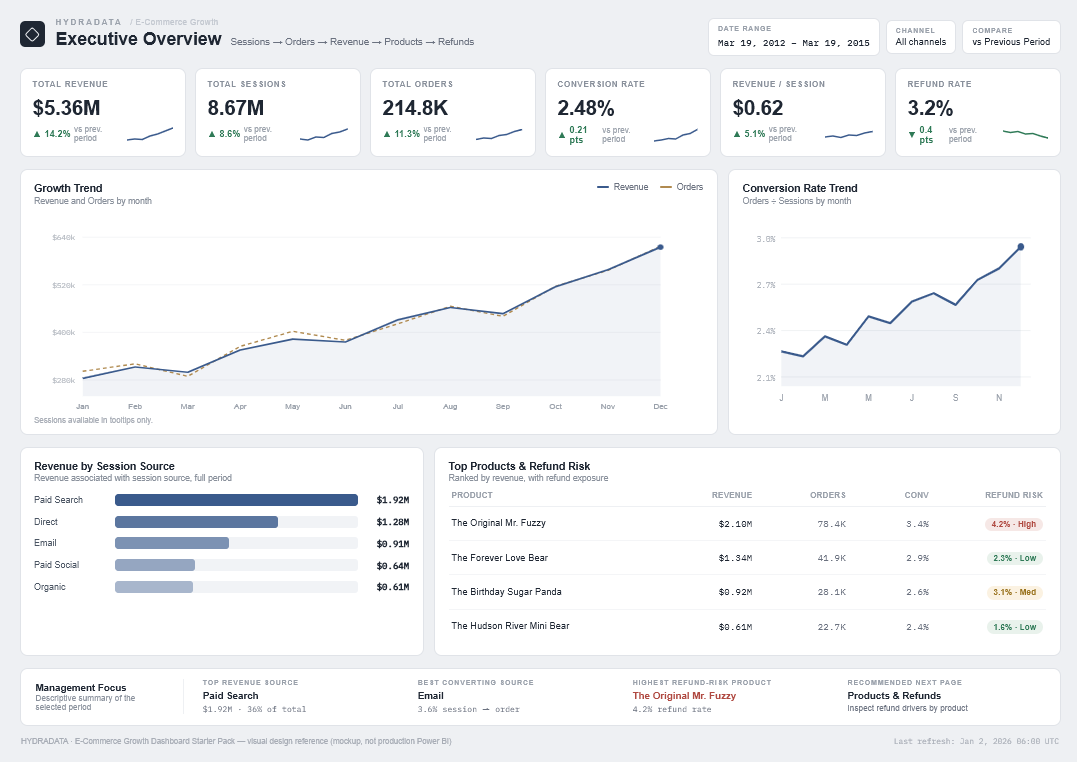
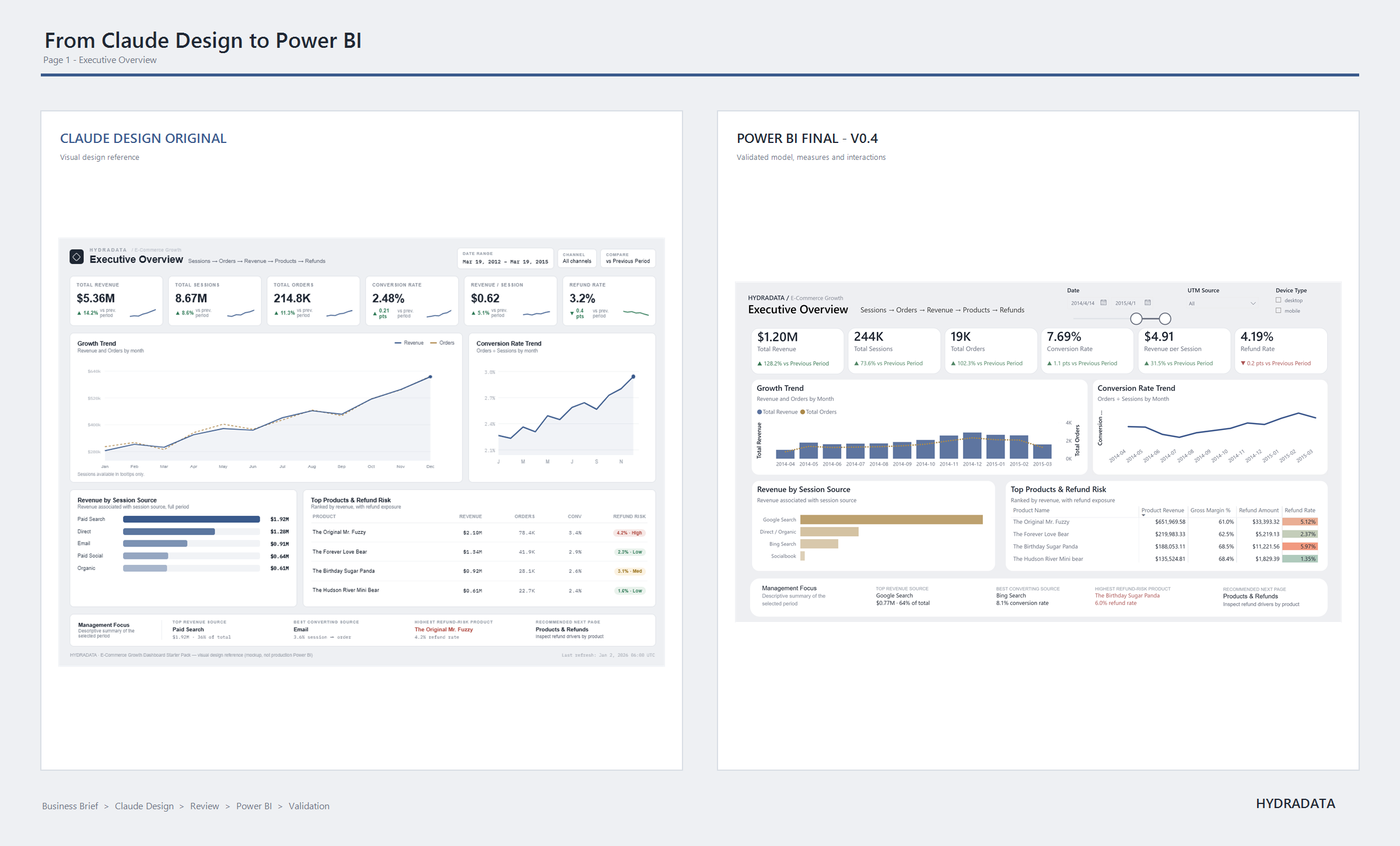
Claude Design was used to explore composition, KPI hierarchy, spacing, color direction and visual density before the Power BI build. The mockup was treated as a design hypothesis, not analysis or implementation.
- Define business questions and page purpose.
- Generate a visual direction and multi-page mockups.
- Review fields, categories, metric grain and wording against the real model.
- Revise the direction, then rebuild and validate it in Power BI.
What the first mockup got wrong
Fast visual exploration still needs a rigorous correction loop.
- Unsupported source labels were replaced with categories present in the data.
- A Tablet category was removed because the model only supported Desktop and Mobile.
- Placeholder-like funnel values were replaced by measures tied to a session-level funnel table.
- Simplified product labels were replaced with the dataset's real product names.
- Causal and predictive wording was removed from the insight layer.
Reviewed Power BI implementation
Four pages shown with disclosed limitations, each tied to a user, question and next action.
Power Query, relationships, DAX, previous-period logic, metric grain, filter context and final interpretation remained human-led. Every displayed page also states what the sample data cannot support. The fifth draft page is withheld under the QA note above rather than presented as corrected.
Executive Overview
A management view of revenue, sessions, orders, conversion, refund risk and previous-period context.
User. Management and functional leads.
Question. Are traffic, orders, revenue efficiency and refund exposure moving together in the selected period?
Possible next action. Use the overview to choose whether the next investigation belongs in marketing, sales or product/refund detail.
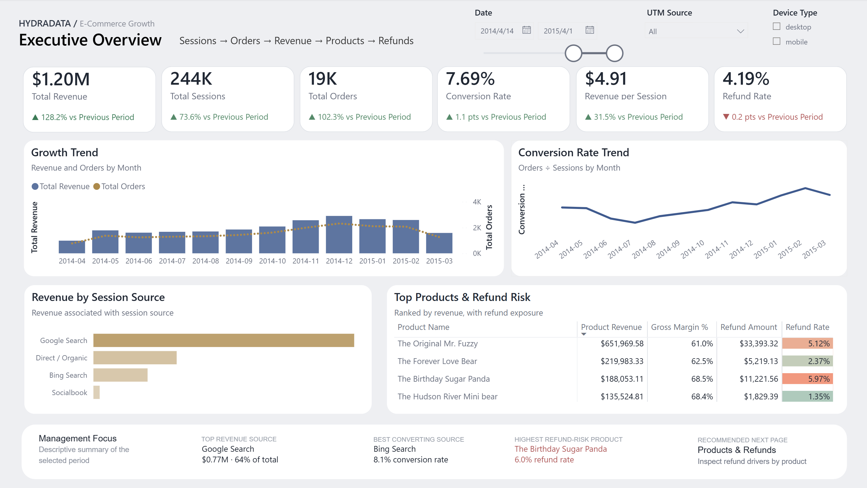
Filter state. 14 April 2014–1 April 2015.
Visual data summary. The selected period shows $1.20M revenue, 244K sessions, 19K orders, 7.69% conversion, $4.91 revenue per session and a 4.19% refund rate. Revenue and orders rise into late 2014 before easing in early 2015. Google Search leads revenue, while The Birthday Sugar Panda has the highest refund rate in the product table.
Limitation. The view is descriptive. Previous-period movements depend on the selected date range and do not establish cause. The refund-rate arrow and color can be read as either literal movement or business effect; see the QA note above.
Marketing & Conversion
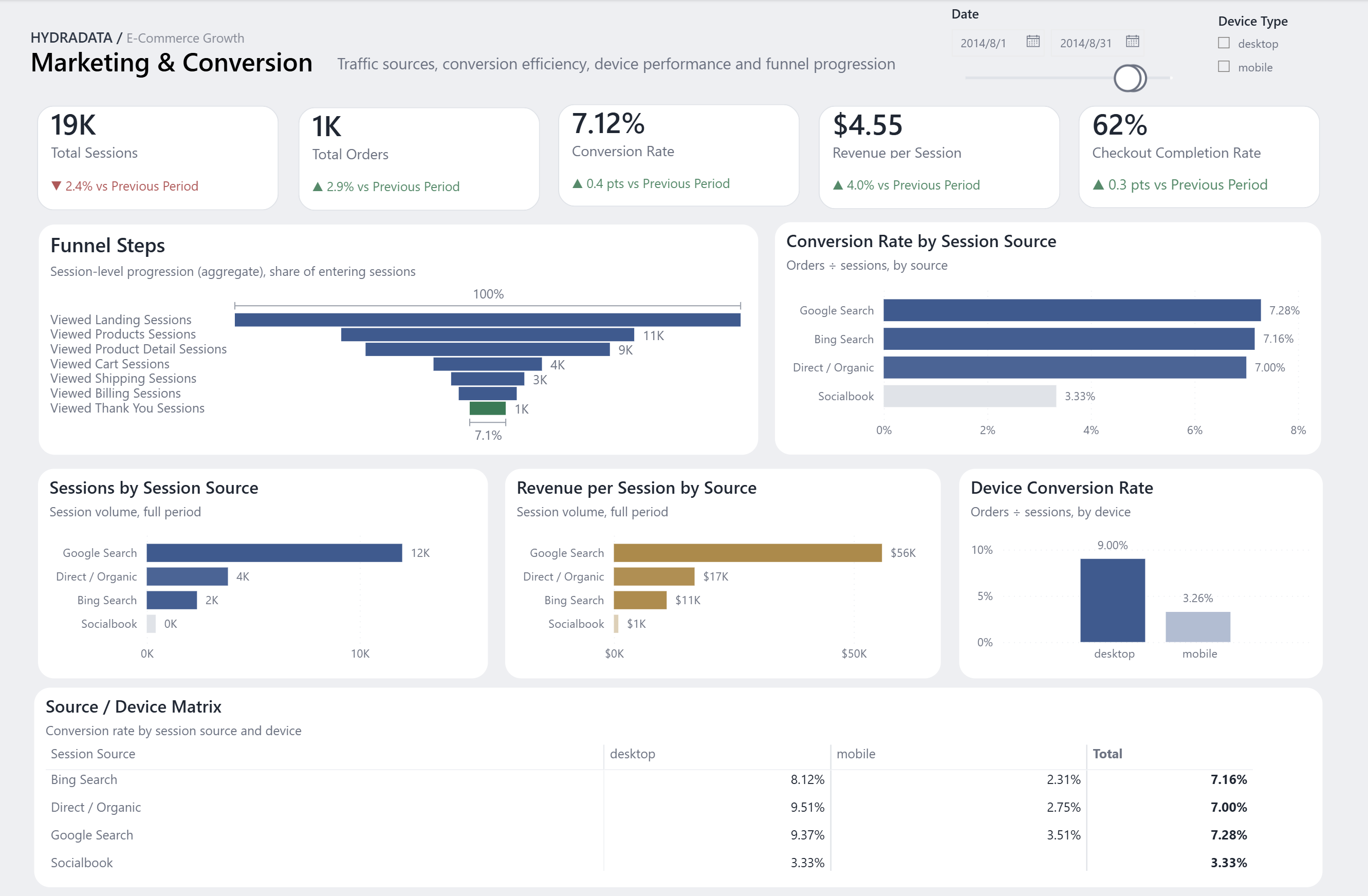
Traffic quality, source and device performance, and the session-level funnel.
User. Growth and marketing teams.
Question. Which available source and device segments combine traffic volume with stronger session conversion?
Possible next action. Identify segments that deserve a closer campaign or landing-page review before changing allocation.
Filter state. 1–31 August 2014.
Visual data summary. The selected month shows 19K sessions, 1K orders, 7.12% conversion, $4.55 revenue per session and 62% checkout completion. Google Search has the highest overall source conversion at 7.28%. Desktop conversion is 9.00% versus 3.26% for mobile, and the session funnel narrows to about 1K thank-you sessions.
Limitation. Available session-source fields support descriptive attribution, not multi-touch attribution or an incrementality claim.
Sales Performance
Order- and item-level commercial performance across revenue, gross profit and margin.
User. Commercial and sales operations teams.
Question. Which products and periods contribute revenue and gross profit, and how does the mix affect margin?
Possible next action. Use product and time breakdowns to focus a commercial review on material mix changes.
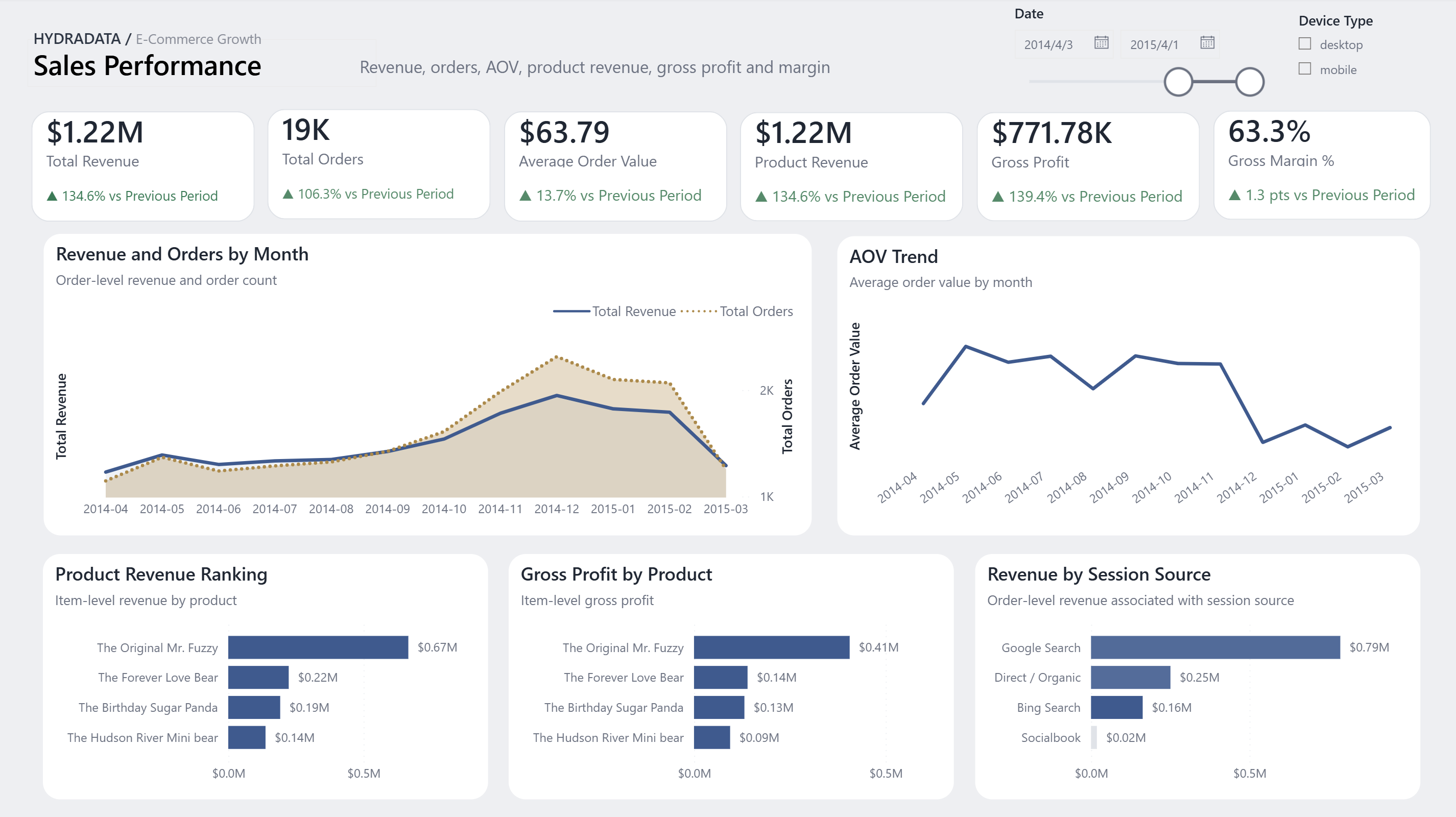
Filter state. 3 April 2014–1 April 2015.
Visual data summary. The selected period shows $1.22M revenue, 19K orders, $63.79 average order value, $771.78K gross profit and 63.3% gross margin. Revenue and orders peak around December 2014. The Original Mr. Fuzzy leads both product revenue and gross profit, while Google Search contributes the most source-associated revenue.
Limitation. The commercial view reflects the fields in the sample dataset; it does not include operating expenses or customer lifetime value.
Products & Refund Analysis
Product contribution, sales volume, margin quality and refund exposure at the appropriate grain.
User. Product and e-commerce operations teams.
Question. Which products combine meaningful sales contribution with elevated refund exposure?
Possible next action. Shortlist products for a quality, merchandising or customer-service investigation outside the dashboard.
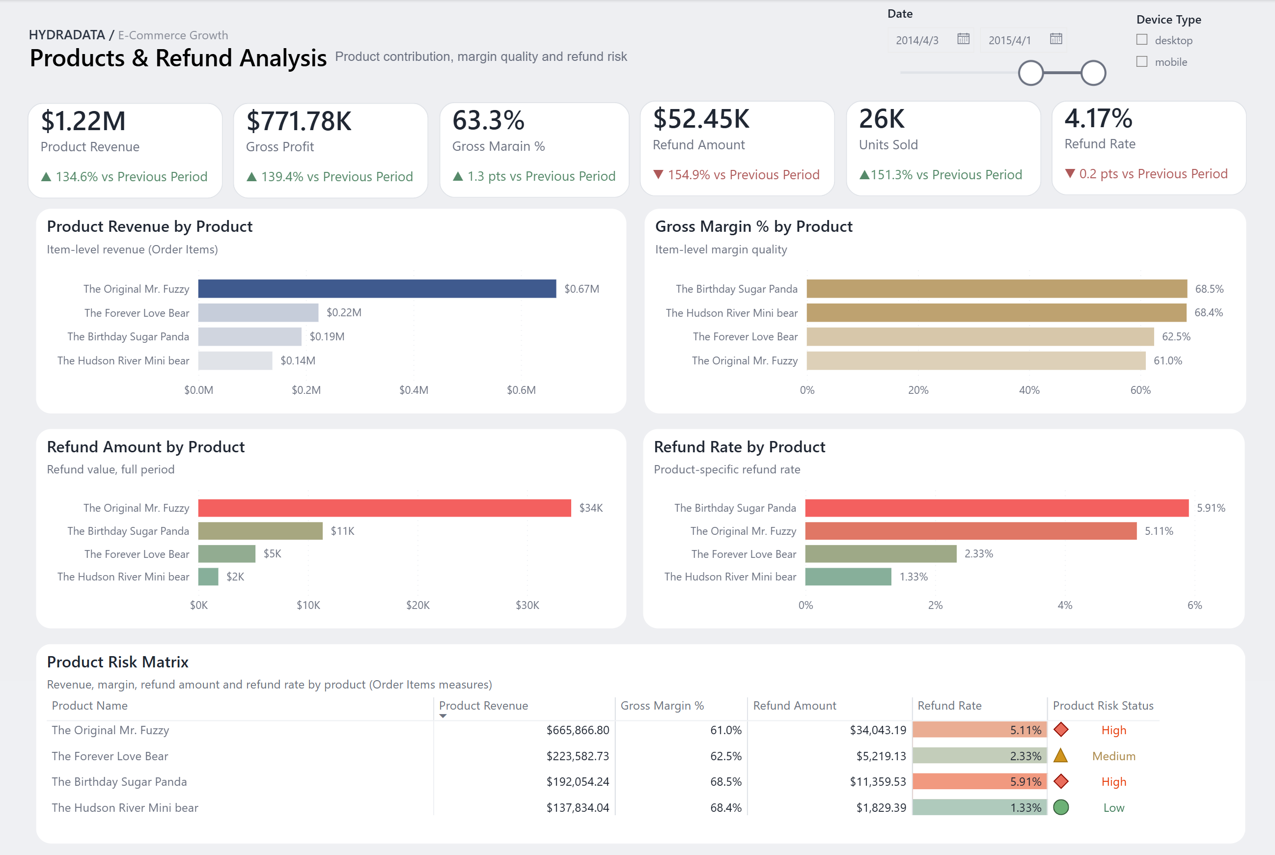
Filter state. 3 April 2014–1 April 2015.
Visual data summary. The selected period shows $1.22M product revenue, $771.78K gross profit, 63.3% gross margin, $52.45K refunded, 26K units sold and a 4.17% refund rate. The Original Mr. Fuzzy leads revenue and refund amount; The Birthday Sugar Panda has the highest refund rate at 5.91%. Both are marked high risk in the product matrix.
Limitation. Refund amount and refund-rate delta cues do not consistently separate literal direction from business favorability, which can be misread. The next iteration will separate those meanings. The sample data also records refund values, not customer-stated reasons.
Portfolio evidence
What this portfolio demonstrates.
These are capability signals and reusable deliverables—not claims of revenue uplift, time savings or other client outcomes.
Decision-first structure. A sequenced reporting narrative that moves from headline performance to focused investigation.
Model discipline. Measures and filters designed around session, order, item and refund-level meaning.
Clear AI responsibility boundary. AI supported visual exploration; modeling, DAX, validation and interpretation stayed human-led.
Reusable delivery approach. A visual system, dashboard architecture, documented logic and repeatable design-to-build review loop.
Continue exploring
Review the wider evidence and methods.
Compare portfolio demonstrations, anonymised engagements and verified client results as they are published.
Why AI dashboard mockups need human validation
Work with HYDRADATA